
A deep, technical focus on game UI/UX design is not a luxury but a fundamental pillar of modern mobile game development. In the hyper-competitive world of mobile gaming, a brilliant game mechanic or a compelling art style is no longer a guarantee of success. The single factor that most often separates a chart-topping hit from an app that is uninstalled within minutes is the quality of its user experience.
In our experience as a development partner, we have seen that the most successful studios treat UI and UX as core architectural components, not as a decorative layer applied at the end of the process. This guide is designed to provide a developer-centric look at the best practices that power engaging mobile games. Together, we will dissect the technical insights needed to create a world-class player journey from the very first tap.
Key Takeaways from This Guide
Before we explore the art and science of game interface design, here is a look at what you will learn.
- We will provide a clear, technical definition of User Interface and User Experience and explain why mastering their synergy is critical for player retention.
- Learn the principles of creating a seamless First-Time User Experience (FTUE) that hooks players and minimizes early churn.
- We will cover best practices for designing the Heads-Up Display (HUD) to be informative yet unobtrusive, supporting the core gameplay without creating clutter.
- Discover architectural patterns for intuitive menus, stores, and inventory systems that enhance the long-term player journey.
- We will break down mobile-specific challenges, including designing for touch, accommodating various screen sizes, and optimizing for performance.
The Foundational Principle Distinguishing UI from UX
Before we can build, we must define. In development circles, the terms User Interface (UI) and User Experience (UX) are often used interchangeably, but they represent two distinct yet deeply interconnected disciplines.
User Interface (UI)
This is the tangible, visual, and interactive layer of your game. It encompasses all the elements a player can see and touch, from the buttons and icons to the sliders, menus, and text displays. UI design is concerned with aesthetics, consistency, and clarity. Is the “Attack” button clear and easy to press? Is the font for the player’s health legible? This is the realm of mobile game interface design.
User Experience (UX)
This is the holistic, emotional, and cognitive feeling a player has while interacting with your game. UX design is the science of making that experience feel effortless, logical, and satisfying. It answers questions like, “How easily can a new player understand how to upgrade their character?” or “Does the store navigation feel intuitive or confusing?” A great UX is often invisible; players do not notice it because they are never frustrated.
A beautiful UI with a terrible UX is like a sports car with a confusing dashboard and a steering wheel on the floor. It may look impressive, but it is ultimately unusable. The goal of great game UI/UX design is to create a perfect synergy where a beautiful interface serves a seamless and intuitive user experience.
The First Five Minutes Onboarding and the First-Time User Experience (FTUE)
The first session a player has with your game is the most critical. Studies show that a significant percentage of players are lost within the first few minutes if the experience is confusing or overwhelming. This is why a meticulously crafted First-Time User Experience (FTUE) is paramount.
The core principle we follow in game UI/UX design is “progressive disclosure.” We do not show the player everything at once. Instead, we introduce mechanics and interface elements one at a time, just as the player needs them.
- Contextual Tutorials
Avoid long, text-heavy tutorial screens at the start of the game. Instead, teach through action. When the player first encounters an enemy, use a simple visual cue to show them the attack button. When they earn their first currency, guide them directly to the one item they can afford to upgrade.
- Clear and Immediate Goals
A new player should never have to ask, “What am I supposed to do now?” The interface should always present a clear, immediate objective. A glowing icon, a simple arrow, or a quest prompt can provide this essential guidance.
- Celebrate Early Wins
The FTUE should be designed to make the player feel smart and successful. The first few actions should lead to satisfying rewards, positive feedback, and a clear sense of accomplishment. This builds the initial dopamine loop that hooks a player.
A well-structured FTUE is a microcosm of the entire development process, requiring careful planning and iteration. The principles of a well-defined mobile app development workflow are directly applicable here, ensuring each step of the player’s introduction is logical and tested.
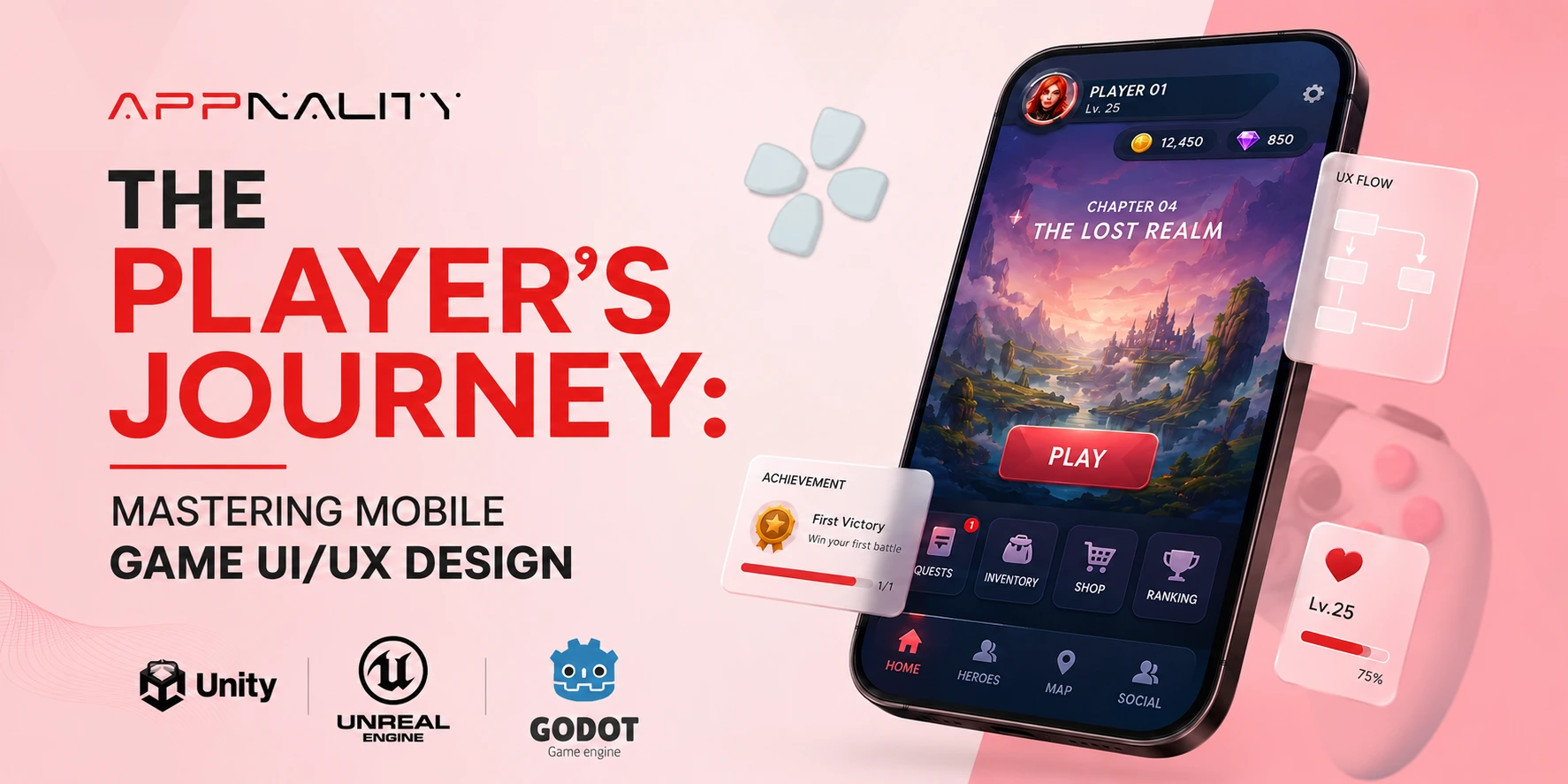
Effective HUD Design for Core Gameplay
The Heads-Up Display (HUD) is the collection of UI elements visible during active gameplay. It is the most viewed part of your mobile game interface design, and its primary purpose is to convey critical information quickly and efficiently without obstructing the player’s view of the game world.
Our approach to HUD design is guided by the principle of “contextual minimalism“. We aim to show only what is necessary, when it is necessary. A cluttered HUD is a significant source of cognitive load for the player.
For example, a player’s health bar does not need a numerical percentage next to it at all times; the visual representation is enough. An ammo count may only need to appear when the player is actively aiming or has a low ammo count. By making elements appear and disappear based on the game’s context, we keep the screen clean and focused on the action.
The clarity of this information, from text to icons, is a specialized skill, and great games often have a dedicated team for it, much like the role of professional game development services in the business world.
Navigating the Meta-Game Menu Architecture and Mobile Game Navigation
Outside of the core gameplay, players will spend a significant amount of time in your game’s menus, managing their inventory, upgrading their characters, or browsing the store. The architecture of this mobile game navigation has a huge impact on the long-term game user experience.
The primary challenge is organizing a potentially large number of features into a structure that is easy to navigate on a small screen. We rely on established design patterns that mobile users are already familiar with.
- The Bottom Tab Bar
This is one of the most common and effective patterns in mobile game navigation. A static bar at the bottom of the screen with 3-5 clear icons (e.g., “Home,” “Characters,” “Store,” “Social”) provides instant access to the main sections of the game.
- The Hamburger Menu
For games with a very large number of secondary features (like settings, support, or detailed stats), a “hamburger” icon in a corner can open a slide-out menu. However, we advise using this for non-critical features, as it hides them from immediate view.
The key is to make a logical hierarchy. The features that players need to access most frequently should be no more than one or two taps away from the main game screen. For massive games with complex systems, the organizational challenge is immense, mirroring the complexity seen in large-scale business platforms.
The insights gained by studying the work of the top enterprise app development companies can be surprisingly relevant to structuring these deep game systems.
Mobile-Specific Considerations in Mobile Game Design
Effective game UI/UX design for mobile requires a deep understanding of the hardware’s unique strengths and limitations. You are not designing for a desktop with a mouse and keyboard; you are designing for a touchscreen device held in the hands. In our development process, we focus heavily on the following mobile-specific factors:
|
Consideration |
Technical Challenge |
Best Practice / Our Approach |
|
The Thumb Zone |
The majority of interactions are performed with the thumbs. The top and center of the screen are hard to reach comfortably, especially on larger phones. |
We place the most frequently used buttons and interactive elements along the bottom and lower sides of the screen, within the natural arc of the thumbs. Critical but less frequent actions can be placed higher up. |
|
Varying Screen Sizes and Aspect Ratios |
There is a huge variety of Android and iOS devices with different screen resolutions and aspect ratios (e.g., standard, notched, “pill” cutouts). |
We design our UI using a responsive layout system with scalable vectors and anchors. We test extensively on different devices to ensure no elements are cut off or improperly scaled. All critical UI must be kept within a “safe zone”. |
|
Performance and Optimization |
Complex UI elements with many animations, transparencies, and particle effects can dramatically impact the game’s frame rate (FPS), especially on older devices. |
We profile the UI’s performance rigorously. We optimize by reducing “overdraw,” using texture atlases to minimize draw calls, and choosing efficient animation methods. A smooth UI is part of a good game user experience. |
|
Battery Consumption |
A UI that requires constant rendering updates or keeps the CPU/GPU running at high capacity will drain the battery quickly, leading to shorter play sessions. |
We design static screens to be truly static, meaning they do not cause any screen updates unless the user interacts with them. We also provide graphics options to allow users on older devices to reduce visual fidelity for better battery life. |
Designing In-App Purchase UI Without Hurting User Experience
How you present monetization opportunities is a critical part of your game’s UI and UX. A predatory, confusing, or overly aggressive store interface can destroy player trust and lead to negative reviews. The best approach is to design a monetization experience that feels like a fair value exchange.
We guide our partners to design in-app stores that feel like a natural part of the game’s world, rather than a tacked-on payment portal.
Clarity and Transparency
The price and the exact contents of every purchase must be crystal clear. Avoid deceptive language or “dark patterns” that trick users into spending.
Value Proposition
The store should clearly communicate the value of its offers. It should present special bundles, first-time buyer deals, and limited-time offers as exciting opportunities rather than demands.
Seamless Integration
The process of making a purchase should be as frictionless as possible, integrating with native iOS and Android payment systems with a single tap. The web views and landing pages associated with these stores must also be perfectly optimized, a task that falls under the umbrella of expert website development services.
Good game UI/UX design in monetization is about respecting the player while still creating compelling opportunities to spend.
Frequently Asked Questions
An Investment in the Player’s Journey
Ultimately, world-class game UI/UX design is an investment, not an expense. It is an investment in your player’s time, their emotional engagement, and their long-term loyalty. A seamless and intuitive interface reduces frustration, increases satisfaction, and keeps players coming back for more. In the crowded mobile market, it is the powerful and sustainable competitive advantages that a studio can have.
From the first five minutes of onboarding to the long-term engagement with the meta-game, every screen and every interaction contributes to the overall game user experience. By following the best practices, you can create experiences that feel like a welcoming and immersive world. If you are ready to build a game that players will love to interact with, our team at Appnality is here to help you design a truly exceptional player journey.